Interactive DowJones Dashboard
| Thomas Cole
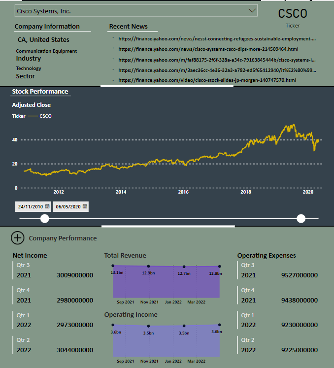
Hi! Thanks for checking out this article! This project is an interactive PowerBI dashboard that allowed me to develop my skills in Python and PowerBI. Essentially, I have created a stock screening dashboard that focuses on the stocks listed in the Dow Jones Industrial Average. The main functionality of the dashboard is to give the user quick insights into specific company performance while also being able to look on a bigger scale at the industry level. Since this is interactive, I highly recommend you go and test the dashboard out for yourself! You can review it at this link!
Here’s a quick snapshot from one of the reports.
Thanks for reading!